
These are the different variations I've
made. Keep the # of the sleeves [ It will be much more simple to discuss it
with numbers instead of desciptions ] .
We don't have any good not-used photos [except for One, which I used here ],
but I can't see the importance of having a unseen band picture on this sleeve.
I think the "not-used" picture is good, but I like the others better.
Thanks for your suggestions about having the title in white (Great!) and I did
fix the warped cirles to the back. It looks better this way, I agree.
All combinations of photos and colour is of course easy to redo.
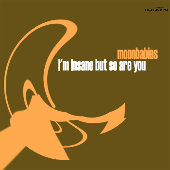
Brown with yellow text...
Front #1 Back #1
Back #2

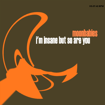
Dark Brown with Orange text...
Front #2 Back
#3

Red with yellow text
Front #3 Back #4
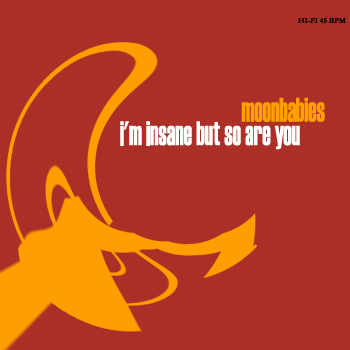

Back #5

The Old back ( I still like it a lot...)
Back #6
